
What is your socio-economic class?
The New York Times has an ‘interactive graphic‘ to help you figure out where you stand in regards to the rest of the population when it comes to your socio-economic status.
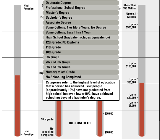
The interactive graphic allows you to enter information about your financial status, and then it displays a graph indicating where these factors place you on the socio-economic scale.
I find it astounding that if you have a undergraduate degree you are in the 91st percentile! In other words, only 9% of the population has a higher degree than you.
(via Get Rich Slowly)
