Posts tagged 'Coding'

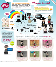
Inspiration: Srown Design Group

Srown.com Screenshot

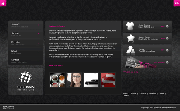
Srown.com is the home of the stylish Srown Design Group. If you are a design group you most certainly have to look good and the team has pulled it off with this slick black and pink website. I like how the background draws the attention to the middle of the page where all of the content is as well as use of the upper corners for the most important navigation: Home and Contact. Srown has even used a bit of pizazz by fading up new content after you click a link.

Looks aside though, and this site has two big problems. For one, the site doesn’t use separate web pages for each section, instead everything is loaded up front and using JavaScript, Srown replaces the middle container with the content. This is bad design as it prevents linking to specific content. There are ways to incorporate a bookmarkable history of pages using JavaScript like the jQuery history plugin. Also, users with scripting disabled will be limited to the first screen of content since the navigation relies entirely on JavaScript.

Ultimately Srown used the wrong technology for the job. Instead, the team should have used Flash which would be more flexible in developing visual effects. There is also a higher chance of a user having Flash installed compared to having JavaScript enabled since the Adobe plugin is installed in 99% of computers worldwide. Instead, Srown settled for the middle of usability (and the middle is the worst) without taking advantage of the extra benefits Flash had to offer.

As you can see a site can be visually stellar but utter crap in usability. Before ever starting a project it is important to sit down and think things through from a technical stand point to see what different technologies have to offer. So while Srown looks awesome it suffers in usability which brings up the important point that substance beats style out any day.

The iPhone Is Not The Only Mobile Web Device

Bi-weekly web magazine A List Apart (ALA) launched two fresh new articles. Unfortunately I was saddened that Erin Kissane, editor at ALA, approved an entire article about designing specifically for the iPhone. I know the iPhone is amazing to many geeks out there but it is no where near as prevalent as the number of web enabled mobile devices.

According to market researcher iSuppli, the number of mobile phone subscribers topped 2.6 billion globally last year. Since I couldn’t find any statistics on mobile web devices, let us assume only a quarter of those can access the web on their phone. That works out to 650 million potential mobile web users. Apple reported it sold 270,000 iPhones over it’s launch weekend but let’s assume they sold 30,000 more shiny devices between now and then. Using the above statistics, the iPhone accounts for only 0.046% of all web-accessible mobile devices; a drop in the proverbial bucket. And I am supposed to be excited to specifically tweak my site for it?

iPhone Vs Mobile Web

The web design world has standards with the goal of being able to code once and access the content in any browser or on any device. Standards arose because in the late 90’s and early 2000 websites were often designed for one browser at a certain resolution. You may remember seeing such terms as “Best viewed in Internet Explorer 5+ with a resolution of 1024×768.” One of the founders of the web, Tim Berners-Lee, even expressed his displeasure of the trend in Technology Review (July 1996):

“Anyone who slaps a ‘this page is best viewed with Browser X’ label on a Web page appears to be yearning for the bad old days, before the Web, when you had very little chance of reading a document written on another computer, another word processor, or another network.”

By designing for a single device, you are essentially jumping back to the dark ages of the web while cutting out a large chunk of the global audience. I agree that mobile web standards leave a lot to be desired but by essentially ignoring the rest of the world (remember iPhones are U.S. only for now) you are only making things worse.

Web technologies like Apple’s mobile Safari and Microsoft’s Deepfish show great promise in fulfilling the web standard utopia. These tools don’t require separate coding for mobile devices which in turn will speed up the adoption of the Internet on-the-go. But it will be several more years before they are in a majority of devices and until then we have to remember that there are other phones out there other than Apple’s precious iPhone.

30 Half-Ass Web Development Extensions

Mashable.com created a list of 30 Firefox extensions for web developers and designers. To be honest, you really only need two: Firebug and the Web Developer Toolbar. These two extensions incorporate nearly every other extension listed, and who wants to manage 28 separate extensions when they could just use two.
Firebug Logo
If you are still digging through source code by hand, then do yourself a favor and get to know Firebug. You’re job will never be the same again.

Inspiration: Stage 5 Studio & Circle Six

Stage 5 Studio Screenshot

Stage5Studio.com

This little site is a nice example of how to do a dark-colored site using bright colors for highlight. I really like the idea of highlighting certain info with a solid background color similar to the rollovers of my links. Best of all, the site is a single page. Straight and to the point.

Circle Six Design Screenshot

blog.CircleSixDesign.com

Circle Six uses a killer color combination of orange and blue. I really like the logo which plays with depth by wrapping through the logo and on top of and over the orange nav bar. I’m not a big fan of the fluff at the bottom. The best thing has to be the Twitter status which fades in both size and color as the updates age.

Circle Six Design Twitter Screenshot

Dynamically Create Dummy Images At Any Size

Over the weekend I worked on a little micro project to help me during web development work. Have you ever needed a dummy image while laying out a site but opening a graphics app, entering the dimensions, saving it out, and uploading said image to your server seemed like too much work? Yea it was a bother for me to.

That’s why I created DummyImage.com which let’s you spit out a filler image at any size you want. All you have to do is construct a URL like so http://dummyimage.com/300×240. Replace the numbers with whatever you want and my script will spit back a GIF image for you.

300×240 Dummy Image from DummyImage.com

I have even packaged up the source code so you can download it, run it on your own server, mash it to bits or whatever else you want. Comments, suggestions, improvements are always welcome and hopefully this thing won’t take down my server from all of the image generating on the back end.

Happy Dummy Imaging!

Inspiration: SEOStudio.co.uk

This search engine optimization company has a slick website with a royal blue and white theme. The main category navigation has an interesting roll-over effect where the icons not selected become grayed out. A reader can maximize the reading room by hiding the nav area which slides shut thanks to the animation prowess of the Script.aculo.us library.

The only thing I would change would change about SEOStudio.co.uk would be the color of the type. Blue on blue provides a low contrast and to aide readability I would pick something lighter.

Smooth icons with a soft glow as well as the eye-catching color choice make this a site I’ll keep track of for times when I need some inspiration.

seostudio.co.uk Screenshot

Eureka! Pullquotes With Ending Quotes

For a long time I have noticed well designed pullquotes that only had the beginning quote. The alternative was a standard text quote that was more bland but had both beginning and ending quotes. Here are some examples I found on SmileyCat.com to better illustrate what I am talking about.

Crazy Egg Pullquote
Big Cartel Pullquote
Rusty Lime Pullquote
All Things Digital Pullquote

The last example is a nice compromise but I prefer pullquotes with a little bit more style. It really bugs me how there is no easy, pure-CSS way of including the ending quotes. That is until now.

WebMasterWall.com has a tutorial featuring a simple method to create “double quotes” (as they call them) using CSS. The trick is to attach the ending quote background image to the

tag and use the pseudo-element :first-letter for the beginning quote graphic. The reason we can get away using this trick without any JavaScript is because IE 5.5+ actually recognizes :first-letter when applied to any block element. Huzzah, this is my second favorite pseudo-element after :hover.

The only gotcha to this is according to W3C specs “Unless you’re using a transitional doctype, text should not be placed directly inside a blockquote element without block-level tags surrounding it.” In other words the text within a

should be wrapped in

tags which would break the blockquote:first-letter styling. This could easily be corrected by using blockquote p as a selector and assuming you don’t have multi paragraph pullquotes. I think that is a reasonable compromise.

We Dudes & Design Float

I stumbled on two sites today that really struck me with their design.

WeDudes.com
WeDude.com Screenshot
WeDudes is a site dedicated to creating little versions of yourself or avatars. I’m really attracted to the fun cartoon style of the page. Not much else to say about this simple site as it is in a closed beta, though I would like to see more of it.

DesignFloat.com
DesignFloat.com Screenshot
This site is another Digg.com inspired social news site but with a focus on all things design. From all of the other Digg clones running on Pligg on the web, this one takes the cake for the best creative stylings. The idea of floating a story up to the top is a clever paradigm and the bright colors give it a fun, light feeling. I’ve added their NetVibes widget to my everyday reading list in case a good story rises.

Faveup – Inspiration For Designers Block

Faveup.com Screenshot

Everyone likes to look at pretty things, designers just get a little more involved. There are a host of design inspiration sites out there but Faveup.com divys their content up into logos, business cards, flash websites, and CSS websites; something for everyone. I love browsing through creative offerings and this site keeps my imagination going in the online side and the print side of things.

Tools To Beautify Your Code

Organized code is easier to read/understand code. When coding you should always keep it as tidy as possible in case someone else (or even you) has to revisit it down the line. Smashing Magazine gathered the best tools to help you clean up your krufty code in various programming languages.

CSS Beautifier

CSS Beautifier looks to be the best CSS optimizer mentioned by Smashing Magazine. You have complete control over the formatting of your style code including the ability to add a new line, space, tab or nothing after pretty much any CSS property. The best feature has got to be the Alphabetizer which will let you sort properties within a selector or the selectors themselves. Be careful with the last options because changing the order of your CSS selectors could change the way your CSS behaves on a site. Order is important in a cascading stylesheet.

My Great Free Online Beautifier for JavaScript does exactly that. There are no options to tweak but this handy tool takes your garbled JavaScript code and lines up the brackets and adds new lines for legibility where needed. Perfect for untangling those long lines of code that were squished down to a single line.

Obviously these two are the tips of the iceberg as Smashing Magazine has more tools for other languages. These two struck me as the most useful to a web developer and that is why they have made it in to my bookmarks of web goodies.