Google Chrome’s Logo Looks Like…
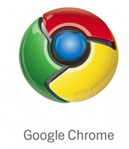
Google’s snazzy new browser, Chrome, is slick both in looks and performance. But look at that logo. It kind of looks like…
the Death Star?
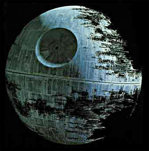
(via Paul Jacobson)
Hal 9000 from 2001: A Space Odyssey?

(via Jaireh aka exuberantfool)
the Windows Media Player 10 icon?
![]()
(via me)
Samus Aran’s Morph Ball from Metroid?
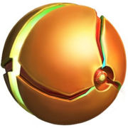
(via Metro Mapper)
the eyes of the Martians in War of the Worlds?
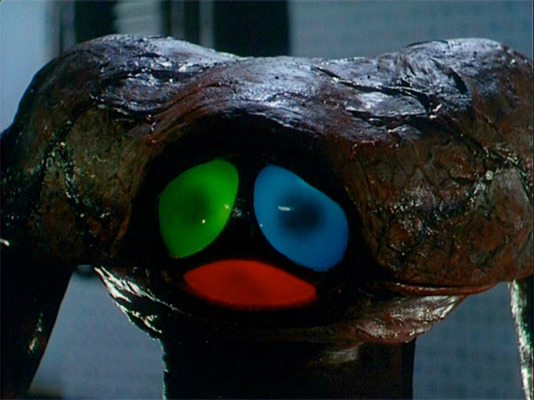
(via John Wohn aka JDub)
the game Simon?
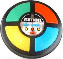
(via Going Like Sixty)
a Poké ball from Pokemon?
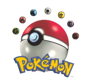
(via various people)
So as you can see Google was inspired by a multitude of geeky things when it came up with the logo for it’s latest project. Let’s hope it wasn’t really inspired by Pokemon. Eck!


I downloaded it, but it doesn’t seem to work with Roboform, so what good is it. BTW, the logo needs to be CHROME!!DUH!
Reply
yeah sure its shit just cause it cant work with ur shitty lit dumb programe
[…] I am not the only one who thinks they look a little similar. Of course how many combinations of Google’s primary colors […]
Yeah it does look like the dead start the eyes of the martians but pokemon?
Reply
[…] is buzzing about. I have no idea where it came from but it is a little out of date with the lack of Google’s Chrome in the […]
[…] logo round?” – I never realized this until Download Squad brought it up. I know the Google Chrome logo isn’t all that […]
Its not the chrome logo. Its concept art of Samus’ newest suit upgreade…
Reply