
Bland Revisions For Revision3.com
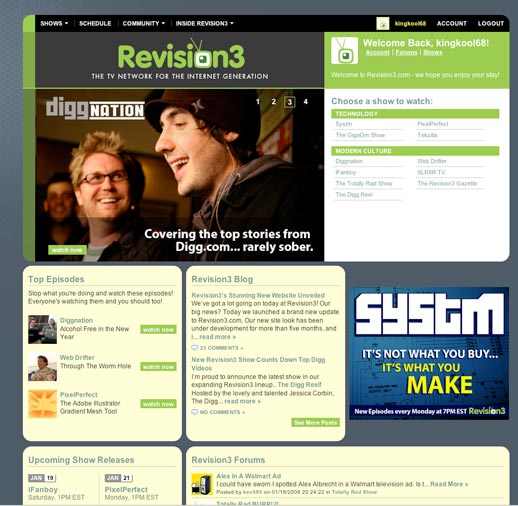
Kevin Rose’s Internet video startup, Revision3.com, unveiled its new look today. The homepage has been simplified providing an immediate focus with a large feature box that rotates through different site promotions. Each show now has it’s own section which is easily accessible from the “Shows” drop down menu along the top of every page. Streaming video flash players on each episode page have been bumped up to 555×337 which really draws viewers in. Each show has a plethora of different subscription formats which are only a tab away from the recent episode list. The overall restructuring is a welcome improvement, but unfortunately it came at the expense of visual design.
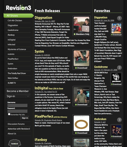
The new color scheme is drab and bland with a “corporate” feeling that first comes to mind. I suppose this is to appeal to advertisers that Revision3 is trying to attract to buy ad inventory but it feels like something from early 2000. The old design (pictured below) felt slick and cutting edge just like the network itself. But the worst offender of this new look is the typography. For one, it is a light gray (hex code #666666) and could stand to be darker (like #333333) for increased contrast and thus increased readability. The line-height is also not set leaving lines scrunched together making it harder to read. In short, the new design is missing the final polish which used to set it apart from other media websites on the net.
Daniel Burka has been the lead designer on most of Kevin Rose’s web projects but it looks like he didn’t have a hand in the new Revision3.com. He must be too busy working on Digg and Pownce, two sites I really admire from a design perspective. Luckily I have no reason to visit the Revision3 site on a regular basis except to subscribe to new shows. I hope they take a second look at things and update the style to match the new functionality.

I agree it is a step back visually. They could have integrated a large image call to action with the old design with much better effect. The ad placements also detract from the design .. something they should have remained in strict control over (design and placement) to keep the overall layout ‘together’.
Reply
An fascinating dialogue is worth a comment. I believe that it is best to write extra on this subject, it may not be a taboo subject however usually people are not brave enough to speak on such topics. To the next. Cheers
Reply
There may be a bundle to find out about this. You made nice points also.
Reply
Can never designed for grandma’s kitchen, Disney first considerations for any young people, as well as shed house keys to be able to any specific auto which include Transponder car keys, you’ll find a person blanketed. Were the full service locksmith who has the particular equipement plus range to produce all essential. Including custom tools.
Reply
I have been taking a gander at your site and chanced upon this decent little post. I have been making an effort to live a hearty lifestyle. Your article has been eye opening. This will assist me in my goal to be a healthy me.
Reply